


I have been working on a hobby project, telemetry on a model rocket, and wanted to be able to display some nice graphs from the data it generates. There are a lot of examples on how to use processing for different applications on-line. It's pretty easy to grab data from a serial device (such as a PIC, or a PIC connected to a data radio), and have a base computer log the data into a .csv file. Graphing was a little harder to find examples for. Hopefully this will help someone that might be interested in using Processing to enhance their project. Hope this gets some people thinking about how they might use it in their projects.
Here are a few of the things that my program does:
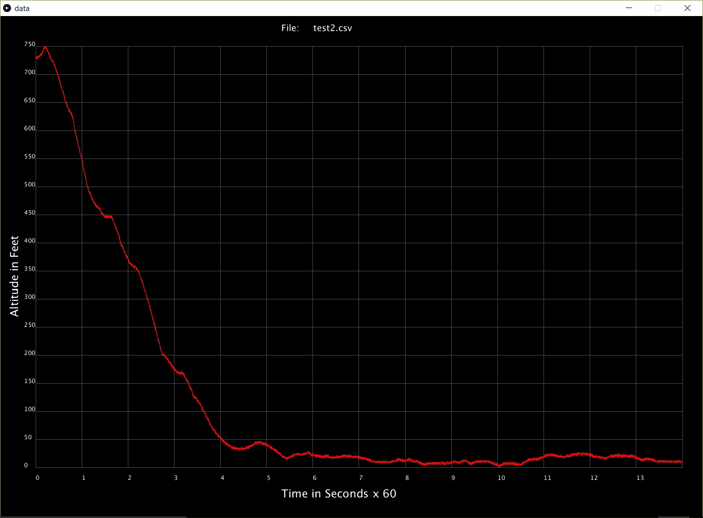
1. Scale the graphs so that 30,000 foot flights, and 300 foot flights would both max the scale of the graph.
2. Allow you to scroll through the different flight .csv log files within the directory with your mouse, and have it draw a graph of the data
3. Allows for portability by allowing for different display sizes without screwing up the graphs
I don't have any actual samples from any test flights yet .... so collecting altitude data while driving some hills in my car had to suffice. Notice the units change between some of the sample files.
The graphing program (data.pde) can be downloaded here along with the samples: https://github.com/radiohound/NXPMot...RocketNXP/data
More info about the entire project, which is a work in progress: https://hackaday.io/project/15425-ro...ponder-and-gui


Bookmarks